Kelsi Franzino (BFA 2017): Creative Lead on New Brightmoor Maker Space Visual Identity
During the Winter 2016 term, Stamps students in Hannah Smotrich's visual identity design course created multi-faceted visual identity systems, branding concepts, and style guides for the Brightmoor Maker Space.
Co-founded by Stamps Professor Nick Tobier and Detroit Community Schools co-founder Bart Eddy, the Brightmoor Maker Space (BMS) is a place for students at Detroit Community High School and residents of Detroit's Brightmoor neighborhood to develop maker skills, sharpen creative thinking, and serve as an incubator for enterprise. The space also provides Stamps students and alums opportunities to benefit from the natural exchange of ideas inherent in maker culture through the Stamps School's Detroit Connections program, the Michelle Schara Artist & Designer in Residency program, and Stamps undergraduate design coursework.
In Professor Smotrich's class, students visited the BMS program at Detroit Community High (the dedicated space is scheduled to open in late 2016), conducted in-depth conversations with the project's key stakeholders, and received two in-process critiques from BMS alums and mentors. Professor Smotrich stated that in addition to a basic understanding of real-world client relationships, "Stamps students were able to develop a fuller understanding of the goals for the maker space and make a strong connection to Detroit Community High School students and their creative work."
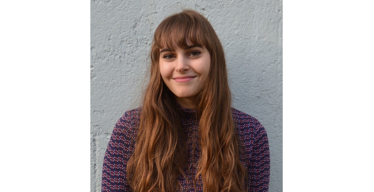
At the end of the course, one student - Kelsi Franzino (Stamps BFA '17) - was selected to receive a project rate for her work, enabling the BMS community to adopt and broadly implement her visual identity system. Recently, the Stamps Communications Team sat down with Kelsi to chat with her about the project, the maker space, and what makes for a strong visual identity.
Stamps: Congrats on your project! Were you surprised to hear that your work was selected?
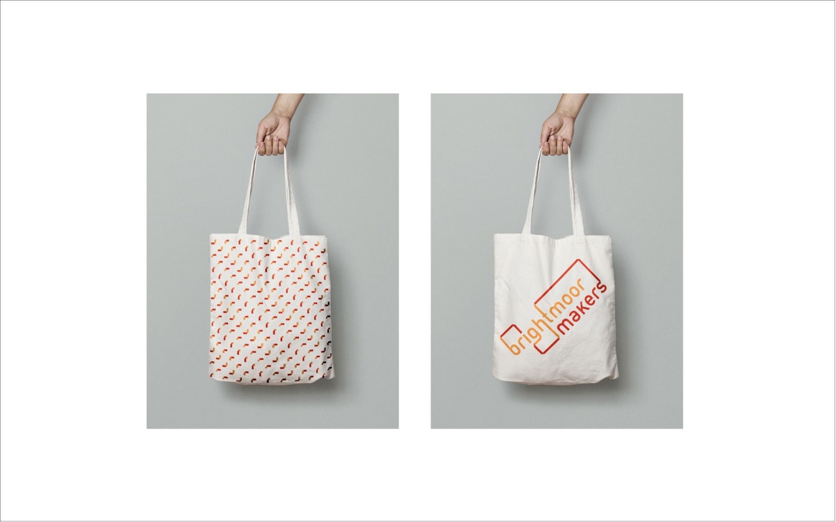
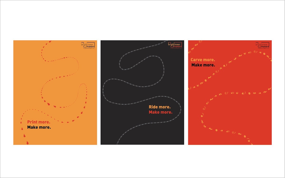
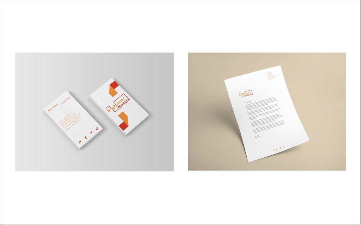
Kelsi: Honestly, I didn't know for sure if they were going to select one of us. I received good feedback from Nick [Tobier] when he came to critique us at the end of the course, though. He really liked my posters and said that he could easily see different applications, different ways my logo could be used.
What did you learn from the project?
It's really challenging to create a new logo. You have to understand the client completely, what the organization is all about, and what their values are. A good designer comes in with a fresh, creative perspective. It's our job to understand and interpret what the client wants in a new way. When the client sees what the designer's vision is, they're given a chance to reframe their thinking. There's definitely a give and take. Also, talking to the students was really helpful. They had first hand experience with what they were doing and really great reflections about their work in the space.
What was the most challenging aspect of the project?
You start out with so many different possibilities of what to do. A lot of your ideas are really literal. When you think of a maker space, you think about tools. You think about what they make in the space. But after all of this, you have to step back and think conceptually. You have to think of the client's values: what impact is the organization having on others through what they're doing?
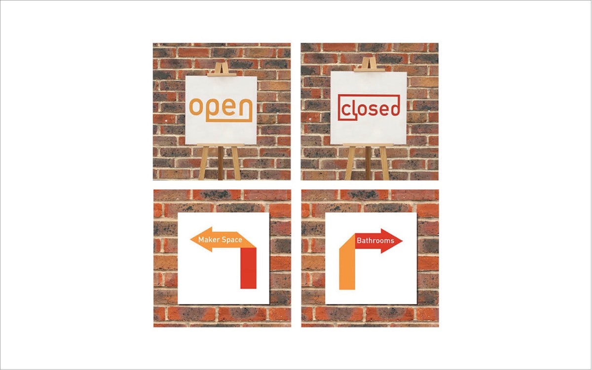
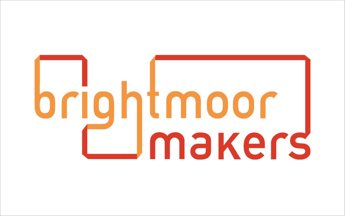
Talk to me about the conceptual underpinnings of your logo design for BMS.
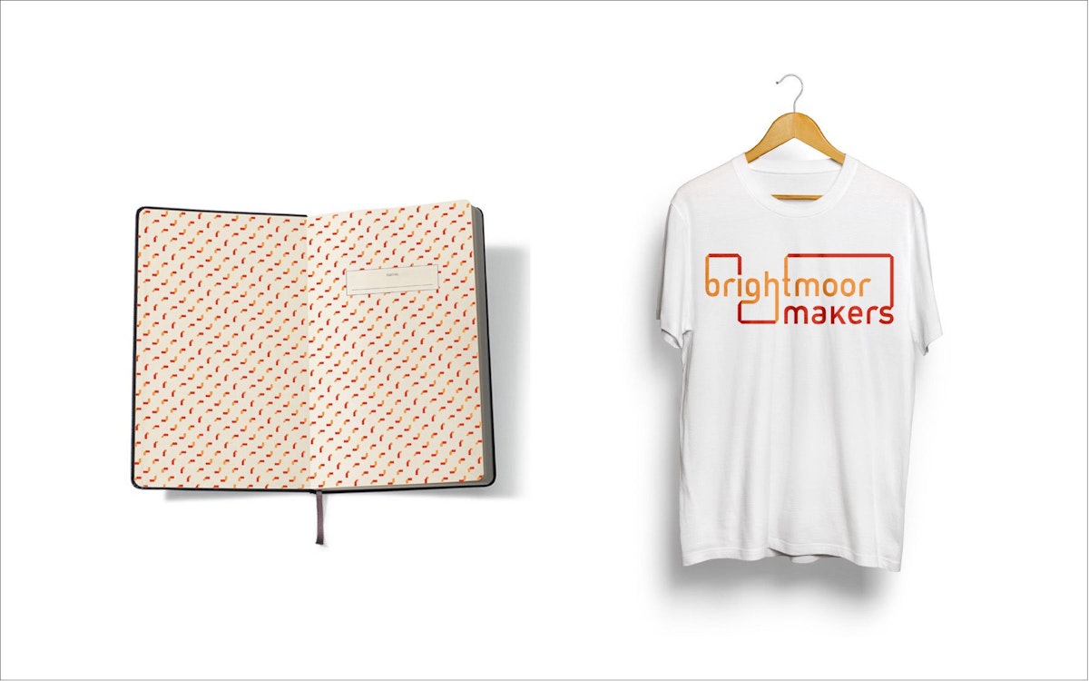
What I really wanted to do was show how the makers are supporting their community through design and the maker projects they create - very community oriented. In my design, the words unfold in a cascading vertical fashion, each word connected to the next by a ribbon. The word "Maker" is set to add balance and support to the text, showcasing the importance of makers in the Brightmoor community. Also, the makers have four different levels they go through in the maker program. At first they learn the equipment and the methods, but at the end they're entrepreneurs. To reflect this, I created four turns in the ribbon, representing the four levels in the process.
Thanks for your time - we're excited for the soft opening of this space this year and to seeing your design in execution.
Me too. Thanks!
Learn more about the Brightmoor Maker Space on Facebook: facebook.com/BrightmoorMakerspace. To learn more about Kelsi Franzino's work, visit kelsifranzino.format.com.